Friday, 12 March 2010

Evaluation, Looking back at your preliminary task, what do you feel you have learnt in the progression from it to the full product?


Generally i have learnt that i need to make my images more bright and eye catching and make them look more interesting so that the reader is drawn to the magazine, and more persuaded to buy it. Also I have learnt how to make my practical work look more professional and sophisticated. For example making the structure of the pages more clear, and generally more aligned so that they look organised and professional.

I have also learnt to listen to my target audience and try and incorporate their ideas into the magazine so that they can relate to the magazine and therefore are more likely to buy it because the things inside appeal to them.

I think that my magazine in the preliminary task wasn't as good because the colours were fairly dull and boring, where as in my final product, the music magazine i have made the colours brighter and bolder, and edited the contrast of the images used, and used bolder and more interesting font so that the pages stand out and generally look more appealing and attractive.

I also found that in my preliminary task my magazine seemed quite babyish, and the language wasn't as sophisticated as it could be, so for my music magazine i made sure that the language was a bit more sophisticated, and therefore would appeal to the audience more.

What have you learnt about technologies from the process of constructing this product?


Whilst creating my music magazine i have used technologies such as publisher, gimp, blog, polls and a digital camera.

The digital camera i used was one of my own and is very simple to use and upload photos to the computer, therefore i got some good images that i have used in my magazine.

Publisher enabled me to put pictures together and create collages of different images and label magazines using arrows and boxes that i added to my blog and make it look more interesting.

Gimp enabled me to edit my images so that i could make them brighter and bolder, and generally make them look more professional and stand out on the page. I learnt how to change the contrast on gimp, so this gave me more knowledge for the future.

The blog was fairly simple to use, and i learnt that its a much easier way to present information because you can edit the posts, and make them look better on the page.

I also learnt about polls that i got off a website and imported them into my blog because it was much easier for people to vote because it was quicker.

Evaluation, How did you attract/address your audience?

I tried to make my magazine attractive as possible to my audience so that they were persuaded to buy my magazine. I decided to make my front cover as eye catching as possible because 70% of people buy their magazines on the spur of the monet just by looking at the front page. Therefore i chose a bold bright image and didnt put that much text around it, so people saw the image first, and judge the magaine on how it stands out compared to the magazines next to it. All the text on the front page is bold and in an interesting font so again this makes it stand out, and eyecatching to people passing by. The front page features words like "Exclusive" and "Win" so people are drawn into this, and therefore more likely to buy the magazine because it looks unique compared to other magazines.

My magazine talks to the audience in a sophisticated manner, however has a touch of attitude so that people are more likely to look at it because its so bold and eyecatching. Someone would want to buy my magazine because its unique and stands out from the crowd with exclusive inerviews, gossip, photoshoots, concert reviews, competitions, style advice, membership and also promotes the website so therefore makes it look more professional and sophisticated.

I did questionnaires before i started the magazine so that i could find out what people wanted in the magazine and what would attract them to a music magazine.

Questionnaire

Female/Male: Female

Age: 17

Do you like r&b music? Yes

How often do you read magazines? Once a week

What would attract you to a music magazine?
Bold colours, interesting features like exclusive things and gossip

What would attract you to a music magazine?
A good front page with an interesting picture that stands out

Questionnaire

Female/Male: Male

Age: 19

Do you like r&b music? Yes

How often do you read magazines? Every few weeks

What would attract you to a music magazine? If its unique, good pictures, bright and interesting pictures, things like style advice and concert reviews

What would attract you to a music magazine?
Definitely a unique and bold front page that stands out and it eye-catching and makes me stop.

I took these answers into considerationa nd made the front page bold and eyecatching, and also made sure that on the double page spread there are interesting pictures so that the reader doesnt get bored.

Evaluation, Who would be the audience for your media product?


I think that the average reader would be a teenager, either male or female and be fairly intellectual and also a r&b fan. I think that my magaizne caters for both males and females because it includes features such as style for males and females, interviews with both male and female celebrities, images that feature males and females, colours that are fairly neautral and suit both males and females etc. I think that the audience would be 16-20 year olds because the magazine is sophisticated but also has a fun/attitude side which suits teenagers. Treatment sheet- "‘Crank’ is the older version of ‘Hip to the Hop’, and is generally aimed at an older audience. The Crank reader is aged 16-20, but older people who are interested in r&b, and hip hop music may also read it because it appeals to their taste of music. ‘Crank’ is generally aimed at both sexes, with typical features for females and males; to make sure that the magazine is versatile. The magazine is aimed at people that want to keep up their knowledge of their favourite r&b artists, and the gossip that comes with fame. The average ‘Crank’ reader is confident, stylish and bold, just like the magazine. ‘Crank’ is for people that are open to listening to different styles of r&b, whether it be grime, hip-hop or rap. "

Evaluation, What kind of media institution might distribute your media product and why?


In the UK at the moment there is a gap in the market for a r&b magazine, and therefore it may be quite hard to find a publisher to publish my magazine. After looking at the magazine 'vibe' i discovered that it is American and is published by an American publisher, Len Burnett.

However i think that Bauer Media may be interested in publishing my magazine because they publish magazines such as Q and Kerrang and they may want to publish an r&b magazine because it would increase their portfolio and make them more appealing for widening their genre and making a magazine that could be unique and would appeal to a lot of people.

My magazine offers a different genre to put in the UK magazine market, and would appeal to alot of r&b fans, mainly teenagers and above. My magazine is unique, and features unique features such as exclusive interviews, concert reviews and celebrity gossip about r&b stars. My magazine offers a different approach to r&b and would give the industry more attitude and make it generally more appealing to people that listen to that type of music, and have an interest in r&b.

I think that there is group of people in the UK that are fans of the genre, yet they are missing out because there s no major r&b music magazine available in the UK at this moment in time. However i think that my magazine would fill this group and alot of people would buy it.

Tuesday, 9 March 2010

Evaluation, How does your media product represent particular social groups?


I have represented the social group of teenagers that are r&b fans and generally listen to r&b music, and are interested in the style and attitude of r&b. I have represented them by using images of younger models that look stylish and that portray the attitude of teenagers. Teenagers are more likely to want to read the magazine if there are people their age in the magazine because it means that they can relate to them . Also generally teenagers like bright colours, and the front page and double page spread include brightly coloured images that stand out. I think that my magazine would appeal to the social group of teenagers that generally enjoy upbeat r&b music because it features interviews with r&b stars and includes concert dates and gossip about the r&b world. The structure of my music magazine is fairly simple and easy to follow, therefore teenagers can find things in the magazine quicker and skip to their favourite part. The language i have used is simple yet it isn't patronising, so that teenagers understand the language, but it isn't so simplified that they are made to feel stupid and inadequate. In my magazine there is an even ration of texts to images so that it doesnt become boring with too much text, but at the same tie informs the reader about what they want to know.

Evaluation, In what ways does your media product use, develop or challenge forms and conventions of real media products? (Double page spread)


In my music magazine I have incorporated many conventions of a typical music magazine that targets the r&b audience. My contents page is structured just like a normal music magazine, and i found that music magazines do alot of double page spreads because they do alot of interviews with bands/artists. Also another typical feature of a music magazine is a photoshoot of that particular artist, so i decided to do a photoshoot and fill the left hand page with images, and the right hand page with the interview. At the right hand side there us the website address, and it is promoting it, this is typical of a music magazine as they want to get more attention, and want people to use their site. On the left hand side there is a list of concert dates, and again this is another typical feature of a music magazine because it promotes the artist/band and informs readres of when the next concerts are, and make the magazine look more professional, and knowledgable.


Monday, 8 March 2010

Evaluation, In what ways does your media product use, develop or challenge forms and conventions of real media products? (Contents page)


In my music magazine I have incorporated many conventions of a typical music magazine that targets the r&b audience. My contents page features a few typical conventions of a music magazine. There is a note from the editor in the top right corner, and after doing research I found that music magazines have this to welcome their readers to the magazine, and it interests the reader because it tells them who edits the magazine. The image of the editor is a mid shot, and she is looking at the camera with her arm reached out which appeals to the audience and make it look as though she is speaking directly to them. The subheadings are bold, and are easy to locate so that the readers can look at their preffered page quicker and easier. The contents page also has the magazine's name on it so that it looks more professional, and also has the date and magazine issue underneath so that it informs the reader. The background image is a medium long shot and he is looking directly at the camera so that the audience feel like he is looking directly at them. After doing some research on the r&b magazine 'Vibe' i found that an image that portrayed attitude was best to use because it interested the reader and ties in with the r&b theme. The colour theme is fairly simple so that it isnt too distracting, and makes the image and text stand out, after doing research i found thatit is typical of music magazines to keep with a simple colour scheme. The structure of my contents page is also typical of a music magazine because it is all under headings, and easy to find pages.

Evaluation, In what ways does your media product use, develop or challenge forms and conventions of real media products? (Front page)


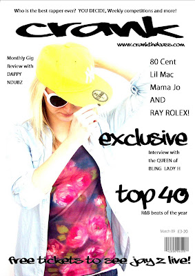
In my music magazine I have incorporated many conventions of a typical music magazine that targets the r&b audience. I had to do some research on r&b magazines because there aren’t that many around and I needed to know what to include in my magazine to make it suit the genre and appeal to a specific audience. On the front page I have created my own name for the magazine which appears as the masthead “Crank”. At the top of the front page there is a strap line which persuades people to buy the magazine because they could win things, and it generally looks more interesting and worth the money. The image in the background is a mid shot, and it is bright and stands out to catch attention and persuade people to buy the magazine. There is blank space around it so that the cover lines looked bolder and stood out, also they are clear to read and it makes sure that the picture is one of the main viewpoints. I have used words such as “exclusive” to draw people in, and making them think that they can’t get it in any other magazine. This is a typical convention of a music magazine, because lots of music magazines have interviews with bands/artists, and label it as “exclusive” because it isn’t happening in any other magazine at that moment in time. I have added the website underneath the masthead which makes people more likely to go onto the website, and also after doing my research I found that a lot of music magazines promote their website on their front page.

Friday, 5 March 2010

Final double page...


I think that this may be the final product as i prefer this layout out of all the drafts that i have done. I have put the quote "the drummer drives me crazy" at the top instead of at the bottom to make it look more interesting and get people to read the interview. It stands out, and i think that this page therefore looks bolder and looks as though it has more attitude. I have added more questions and more text at the side to make the page look fuller are more worth the money.

Wednesday, 3 March 2010

Draft 3, Double Page, adding a film strip, changing around text/banners

I decided to put some of the images in a film strip to make it look more interesting, and more like a photoshoot. It also ties in with the genre of r&b because it adds attitude to the images because it makes them stand out more. I have decided to take away the first banner "Exclusive photoshoot" because i felt that it was too much and was overcrowding and over complicating the page.

Draft2, double page spread

This is my first draft of my double page spread, i decided to put the photo's on the left hand side, and label it as an exclusive photo shoot. The banners at the top of each page are in r&b font and are bold and stand out. I have included concert dates in the right hand corner of the left page, so that the page isnt completely dominated by pictures. The images consist of midshots, medium close ups and also one medium long shot. I have included a quote from the interview at the bottom of the right hand page, which makes the page look more interesting and highlights the important parts of the interview and makes the reader want to read the interview to find out what question the quote was from and what it was all about. On the right hand side of the right page i have included a vertical strip that sponsers the website and persuades readers to go on it to find out more information about "Lady H".

Tuesday, 2 March 2010

Final contents page...


I decided to make "contents" blend in with the word "crank"and i like the effect it gave to the page, and made it look unusual.

Draft4, Contents, changing the position of "contents" and the date


I decided to play around with "contents" and see if it looked better horizontally than vertically. I quite like the fact that "crank" is vertical and "contents" is horizontal.

Draf 3, Contents, Aligning the text, adding a note from the editor

I have decided to use the same image becaue it portrays attitude, and thats what r&b is all about. I have added a note frm the editor saying "Welcome, we hope you enjoy the newest edition of crank!". I decided to add this because alot of magazines do this, which makes it look more professional, and its welcoming the readers to the magazine. I eligned the text on the right towards the edge, which generally makes the page look more organised and better.

Monday, 1 March 2010

Draft 2, contents page


The masthead "contents" is split up and wrote vertically and is in r&b font, and stands out. The subheadings are also bold and are in r&b font. The text underneath the headings are a normal font because i didnt want to overdo on the r&b font because it would have looked tacky. I have added a picture of the editor to use up some of the space on the page, and make it look over all more professional. I have also put the magazines name "crank vertically down next to "contents".

Final front page...


I made the barcode smaller, and added the date by the price. I also aligned the text because it looked uneven.