Friday, 12 March 2010

Evaluation, Looking back at your preliminary task, what do you feel you have learnt in the progression from it to the full product?


Generally i have learnt that i need to make my images more bright and eye catching and make them look more interesting so that the reader is drawn to the magazine, and more persuaded to buy it. Also I have learnt how to make my practical work look more professional and sophisticated. For example making the structure of the pages more clear, and generally more aligned so that they look organised and professional.

I have also learnt to listen to my target audience and try and incorporate their ideas into the magazine so that they can relate to the magazine and therefore are more likely to buy it because the things inside appeal to them.

I think that my magazine in the preliminary task wasn't as good because the colours were fairly dull and boring, where as in my final product, the music magazine i have made the colours brighter and bolder, and edited the contrast of the images used, and used bolder and more interesting font so that the pages stand out and generally look more appealing and attractive.

I also found that in my preliminary task my magazine seemed quite babyish, and the language wasn't as sophisticated as it could be, so for my music magazine i made sure that the language was a bit more sophisticated, and therefore would appeal to the audience more.

What have you learnt about technologies from the process of constructing this product?


Whilst creating my music magazine i have used technologies such as publisher, gimp, blog, polls and a digital camera.

The digital camera i used was one of my own and is very simple to use and upload photos to the computer, therefore i got some good images that i have used in my magazine.

Publisher enabled me to put pictures together and create collages of different images and label magazines using arrows and boxes that i added to my blog and make it look more interesting.

Gimp enabled me to edit my images so that i could make them brighter and bolder, and generally make them look more professional and stand out on the page. I learnt how to change the contrast on gimp, so this gave me more knowledge for the future.

The blog was fairly simple to use, and i learnt that its a much easier way to present information because you can edit the posts, and make them look better on the page.

I also learnt about polls that i got off a website and imported them into my blog because it was much easier for people to vote because it was quicker.

Evaluation, How did you attract/address your audience?

I tried to make my magazine attractive as possible to my audience so that they were persuaded to buy my magazine. I decided to make my front cover as eye catching as possible because 70% of people buy their magazines on the spur of the monet just by looking at the front page. Therefore i chose a bold bright image and didnt put that much text around it, so people saw the image first, and judge the magaine on how it stands out compared to the magazines next to it. All the text on the front page is bold and in an interesting font so again this makes it stand out, and eyecatching to people passing by. The front page features words like "Exclusive" and "Win" so people are drawn into this, and therefore more likely to buy the magazine because it looks unique compared to other magazines.

My magazine talks to the audience in a sophisticated manner, however has a touch of attitude so that people are more likely to look at it because its so bold and eyecatching. Someone would want to buy my magazine because its unique and stands out from the crowd with exclusive inerviews, gossip, photoshoots, concert reviews, competitions, style advice, membership and also promotes the website so therefore makes it look more professional and sophisticated.

I did questionnaires before i started the magazine so that i could find out what people wanted in the magazine and what would attract them to a music magazine.

Questionnaire

Female/Male: Female

Age: 17

Do you like r&b music? Yes

How often do you read magazines? Once a week

What would attract you to a music magazine?
Bold colours, interesting features like exclusive things and gossip

What would attract you to a music magazine?
A good front page with an interesting picture that stands out

Questionnaire

Female/Male: Male

Age: 19

Do you like r&b music? Yes

How often do you read magazines? Every few weeks

What would attract you to a music magazine? If its unique, good pictures, bright and interesting pictures, things like style advice and concert reviews

What would attract you to a music magazine?
Definitely a unique and bold front page that stands out and it eye-catching and makes me stop.

I took these answers into considerationa nd made the front page bold and eyecatching, and also made sure that on the double page spread there are interesting pictures so that the reader doesnt get bored.

Evaluation, Who would be the audience for your media product?


I think that the average reader would be a teenager, either male or female and be fairly intellectual and also a r&b fan. I think that my magaizne caters for both males and females because it includes features such as style for males and females, interviews with both male and female celebrities, images that feature males and females, colours that are fairly neautral and suit both males and females etc. I think that the audience would be 16-20 year olds because the magazine is sophisticated but also has a fun/attitude side which suits teenagers. Treatment sheet- "‘Crank’ is the older version of ‘Hip to the Hop’, and is generally aimed at an older audience. The Crank reader is aged 16-20, but older people who are interested in r&b, and hip hop music may also read it because it appeals to their taste of music. ‘Crank’ is generally aimed at both sexes, with typical features for females and males; to make sure that the magazine is versatile. The magazine is aimed at people that want to keep up their knowledge of their favourite r&b artists, and the gossip that comes with fame. The average ‘Crank’ reader is confident, stylish and bold, just like the magazine. ‘Crank’ is for people that are open to listening to different styles of r&b, whether it be grime, hip-hop or rap. "

Evaluation, What kind of media institution might distribute your media product and why?


In the UK at the moment there is a gap in the market for a r&b magazine, and therefore it may be quite hard to find a publisher to publish my magazine. After looking at the magazine 'vibe' i discovered that it is American and is published by an American publisher, Len Burnett.

However i think that Bauer Media may be interested in publishing my magazine because they publish magazines such as Q and Kerrang and they may want to publish an r&b magazine because it would increase their portfolio and make them more appealing for widening their genre and making a magazine that could be unique and would appeal to a lot of people.

My magazine offers a different genre to put in the UK magazine market, and would appeal to alot of r&b fans, mainly teenagers and above. My magazine is unique, and features unique features such as exclusive interviews, concert reviews and celebrity gossip about r&b stars. My magazine offers a different approach to r&b and would give the industry more attitude and make it generally more appealing to people that listen to that type of music, and have an interest in r&b.

I think that there is group of people in the UK that are fans of the genre, yet they are missing out because there s no major r&b music magazine available in the UK at this moment in time. However i think that my magazine would fill this group and alot of people would buy it.

Tuesday, 9 March 2010

Evaluation, How does your media product represent particular social groups?


I have represented the social group of teenagers that are r&b fans and generally listen to r&b music, and are interested in the style and attitude of r&b. I have represented them by using images of younger models that look stylish and that portray the attitude of teenagers. Teenagers are more likely to want to read the magazine if there are people their age in the magazine because it means that they can relate to them . Also generally teenagers like bright colours, and the front page and double page spread include brightly coloured images that stand out. I think that my magazine would appeal to the social group of teenagers that generally enjoy upbeat r&b music because it features interviews with r&b stars and includes concert dates and gossip about the r&b world. The structure of my music magazine is fairly simple and easy to follow, therefore teenagers can find things in the magazine quicker and skip to their favourite part. The language i have used is simple yet it isn't patronising, so that teenagers understand the language, but it isn't so simplified that they are made to feel stupid and inadequate. In my magazine there is an even ration of texts to images so that it doesnt become boring with too much text, but at the same tie informs the reader about what they want to know.

Evaluation, In what ways does your media product use, develop or challenge forms and conventions of real media products? (Double page spread)


In my music magazine I have incorporated many conventions of a typical music magazine that targets the r&b audience. My contents page is structured just like a normal music magazine, and i found that music magazines do alot of double page spreads because they do alot of interviews with bands/artists. Also another typical feature of a music magazine is a photoshoot of that particular artist, so i decided to do a photoshoot and fill the left hand page with images, and the right hand page with the interview. At the right hand side there us the website address, and it is promoting it, this is typical of a music magazine as they want to get more attention, and want people to use their site. On the left hand side there is a list of concert dates, and again this is another typical feature of a music magazine because it promotes the artist/band and informs readres of when the next concerts are, and make the magazine look more professional, and knowledgable.


Monday, 8 March 2010

Evaluation, In what ways does your media product use, develop or challenge forms and conventions of real media products? (Contents page)


In my music magazine I have incorporated many conventions of a typical music magazine that targets the r&b audience. My contents page features a few typical conventions of a music magazine. There is a note from the editor in the top right corner, and after doing research I found that music magazines have this to welcome their readers to the magazine, and it interests the reader because it tells them who edits the magazine. The image of the editor is a mid shot, and she is looking at the camera with her arm reached out which appeals to the audience and make it look as though she is speaking directly to them. The subheadings are bold, and are easy to locate so that the readers can look at their preffered page quicker and easier. The contents page also has the magazine's name on it so that it looks more professional, and also has the date and magazine issue underneath so that it informs the reader. The background image is a medium long shot and he is looking directly at the camera so that the audience feel like he is looking directly at them. After doing some research on the r&b magazine 'Vibe' i found that an image that portrayed attitude was best to use because it interested the reader and ties in with the r&b theme. The colour theme is fairly simple so that it isnt too distracting, and makes the image and text stand out, after doing research i found thatit is typical of music magazines to keep with a simple colour scheme. The structure of my contents page is also typical of a music magazine because it is all under headings, and easy to find pages.

Evaluation, In what ways does your media product use, develop or challenge forms and conventions of real media products? (Front page)


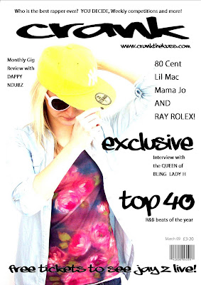
In my music magazine I have incorporated many conventions of a typical music magazine that targets the r&b audience. I had to do some research on r&b magazines because there aren’t that many around and I needed to know what to include in my magazine to make it suit the genre and appeal to a specific audience. On the front page I have created my own name for the magazine which appears as the masthead “Crank”. At the top of the front page there is a strap line which persuades people to buy the magazine because they could win things, and it generally looks more interesting and worth the money. The image in the background is a mid shot, and it is bright and stands out to catch attention and persuade people to buy the magazine. There is blank space around it so that the cover lines looked bolder and stood out, also they are clear to read and it makes sure that the picture is one of the main viewpoints. I have used words such as “exclusive” to draw people in, and making them think that they can’t get it in any other magazine. This is a typical convention of a music magazine, because lots of music magazines have interviews with bands/artists, and label it as “exclusive” because it isn’t happening in any other magazine at that moment in time. I have added the website underneath the masthead which makes people more likely to go onto the website, and also after doing my research I found that a lot of music magazines promote their website on their front page.

Friday, 5 March 2010

Final double page...


I think that this may be the final product as i prefer this layout out of all the drafts that i have done. I have put the quote "the drummer drives me crazy" at the top instead of at the bottom to make it look more interesting and get people to read the interview. It stands out, and i think that this page therefore looks bolder and looks as though it has more attitude. I have added more questions and more text at the side to make the page look fuller are more worth the money.

Wednesday, 3 March 2010

Draft 3, Double Page, adding a film strip, changing around text/banners

I decided to put some of the images in a film strip to make it look more interesting, and more like a photoshoot. It also ties in with the genre of r&b because it adds attitude to the images because it makes them stand out more. I have decided to take away the first banner "Exclusive photoshoot" because i felt that it was too much and was overcrowding and over complicating the page.

Draft2, double page spread

This is my first draft of my double page spread, i decided to put the photo's on the left hand side, and label it as an exclusive photo shoot. The banners at the top of each page are in r&b font and are bold and stand out. I have included concert dates in the right hand corner of the left page, so that the page isnt completely dominated by pictures. The images consist of midshots, medium close ups and also one medium long shot. I have included a quote from the interview at the bottom of the right hand page, which makes the page look more interesting and highlights the important parts of the interview and makes the reader want to read the interview to find out what question the quote was from and what it was all about. On the right hand side of the right page i have included a vertical strip that sponsers the website and persuades readers to go on it to find out more information about "Lady H".

Tuesday, 2 March 2010

Final contents page...


I decided to make "contents" blend in with the word "crank"and i like the effect it gave to the page, and made it look unusual.

Draft4, Contents, changing the position of "contents" and the date


I decided to play around with "contents" and see if it looked better horizontally than vertically. I quite like the fact that "crank" is vertical and "contents" is horizontal.

Draf 3, Contents, Aligning the text, adding a note from the editor

I have decided to use the same image becaue it portrays attitude, and thats what r&b is all about. I have added a note frm the editor saying "Welcome, we hope you enjoy the newest edition of crank!". I decided to add this because alot of magazines do this, which makes it look more professional, and its welcoming the readers to the magazine. I eligned the text on the right towards the edge, which generally makes the page look more organised and better.

Monday, 1 March 2010

Draft 2, contents page


The masthead "contents" is split up and wrote vertically and is in r&b font, and stands out. The subheadings are also bold and are in r&b font. The text underneath the headings are a normal font because i didnt want to overdo on the r&b font because it would have looked tacky. I have added a picture of the editor to use up some of the space on the page, and make it look over all more professional. I have also put the magazines name "crank vertically down next to "contents".

Final front page...


I made the barcode smaller, and added the date by the price. I also aligned the text because it looked uneven.

Friday, 26 February 2010

Front page, draft 3 with added barcode and price


I have added a barcode and price to make the magazine look more realistic. I decided to have the price as £3-20 because it looks worth the money, and thats the usual price of a music magazine.

Front page, draft 2

I have decided to use the same image because it is bright and stands out, but i changed aroud some of the sunheadings and text to make the page look less complicated, and easier to look at.

Front page draft


This is the draft of my front page with an image in the background, The image is bright and stands out, and ties in with the theme of R&B. The headlines "Exclusive" and "Top 40" are bold, and stand out, however i think that i will swap some headlines around, and maybe limit the amount of text so that picture stands out, and the page doesnt become too overcrowded and complicated. The masthead is "Crank" and i have stretched it to the width of the magazine. It is in r&b font, and is bold. This makes it stand out, and easily recognised for being part of the r&b theme. The strapline at the top is also in bold and in an r&b font. The website is at the bottom, but i think that i will swap it around to make it look better, and maybe make it smaller.

Thursday, 25 February 2010

Contents Page, draft


This is my first draft of my contents page. I decided to use an image as the bavkground that had a lot of white space around it so that the text stood out, and was easy to be seen. I decided to use a different font for the headlines, and then a normal font for the information underneath. This makes the page look more sophisticated, and also makies it easier for people to find what they are looking for in the magazine.
I tried to mix up the page numbers so that it looks more realistic compared to having it in order.
The image contains fairly simple colours and keeps with the theme of bacl and wite, which makes it look mopre sophisticated and expensive. The model is looking directly at the camera which immeiately gets the reader invlolved. The face he is pulling ties in with the theme of r&b because it is all about attitude, and the facial expression portrays this.

Monday, 8 February 2010

A few of the Questions and answers from the interview...

  • Dappy: What’s been the best thing about this year?
    Lady h: Wow there’s been so many things! But I have to say that the best thing has been taking my family to one of my concerts. They of course got VIP treatment, and whilst I was performing they were on the front row. It was one of the best feelings that I've ever had.

  • Dappy: Have you got any pet hates?
    Lady h: I do actually, I cant stand it when people constantly tap their feet and fingers on a surface. The drummer drives me crazy! He is always tapping his fingers, and it gets to the point when I have to tell him to shut up.

  • Dappy: Who do you look up to?
    Lady h: I like unique music, and especially keen on Joss Stone’s material, but of course everyone aspires to be as good as R&B legends like Beyonce and Jay Z.

  • Dappy: Now your back in the UK what are your plans?
    Lady h: I’m not back for long actually, I’ve just come to see some family and friends, and record a new track with Global records and then im off to New York for the music festival “Grime”.


Draft, double page spread, with interview


I have decided to keep the same layout, and have now began focusing on the interview itself. I have looked through exising music magazine interview to try and get some idea for the kind of questions that rare asked. The questions are both personal and commercial, and so its quite interesting to read. I didnt want to put too many questions because otherwise the reader will get bored. There are some serious questions and some laid back ones to, so it looks more realistic. I think that the photo shoot on the other page will be surrounded by some of her quotes throughoutthe interview, and it will generally make the page look fuller and more interesting.

Draft, double page spread


This is a simple draft of my double page spread. The double page spread is going to be an interview with 'Lady h' and will feature personal and commercial questions, and also an 'exclusive' photo shoot. At the side of the interview there are subheadings promoting the website, to try and get more users looking at the magazine on the internet as well as reading he hard copy. I want to have quite a simple layout of the double page spread so that it is easier to read, and looks more sophisticated.

Draft, front cover without image


My first draft of the front cover. I will be adding a photo in the background, and the text will surround the image, and the text will stand out more and the page will generally look fuller, more interesting and worth the money. I will be keeping to black text because i feel that simple looks more effective and sophisticated.


Monday, 1 February 2010

Draft Layout designs

I prefer this layout beacuse the cover lines merge into the image, and it all together looks more sophisticated, however the design itself is still fairly simple.

Draft Layout designs


This is fairly similar to the last design, however the cover lines are in the left hand corner. The design is still simple, and means that the image will stand out.

Draft Layout designs

This design is simple, and clear, and the cover lines surround the image, that is used as the background. The masthead will be at the top in bold, and the banner above it.

Friday, 29 January 2010

pollcode.com free polls
What age range should i focus my magazine on?
12-15 16-19 20-23   

Font for my music magazine


I have come up with a few fonts that i think could tie in with the genre of r&b, i have chose ones that are fairly modern, and ones that look interesting and young.


Please comment (:

Treatment Sheet

The magazine: Crank

Target readership: ‘Crank’ is the older version of ‘Hip to the Hop’, and is generally aimed at an older audience. The Crank reader is aged 16-20, but older people who are interested in r&b, and hip hop music may also read it because it appeals to their taste of music. ‘Crank’ is generally aimed at both sexes, with typical features for females and males; to make sure that the magazine is versatile. The magazine is aimed at people that want to keep up their knowledge of their favourite r&b artists, and the gossip that comes with fame. The average ‘Crank’ reader is confident, stylish and bold, just like the magazine. ‘Crank’ is for people that are open to listening to different styles of r&b, whether it be grime, hip-hop or rap.

Form and style: ‘Crank’ is an A4 full colour magazine which contains updated information and gossip on r&b celebrities, featuring exclusive interviews and photo shoots, gig reviews, the latest news and style tips on how to dress like your favourite r&b star. The cover uses different r&b artists, and is usually taken in a mid or long shot to make it look more interesting and reel in the readers. The image acts as the background to the cover, with the text surrounding it. It contains colours such as dark purple and black which makes it seem more ‘cool’ and ties in with the theme of r&b. The front cover is fairly simple, but interesting enough to make sure that it will be bought. On each front cover there will always be an r&b celebrity ranging from Eminem to Kanye West, to Britney Spears. These act as role models for the readers, and make them more likely to buy it because it features a celebrity. The cover lines are bold, and stand out and feature things that r&b fans would want to read about, such as gig reviews and interviews. At the top there is a banner, which includes information about special offers and competitions. The magazine will be sold at £1.80, which is fairly cheap for a music magazine, which makes it more appealing for a reader, however on the plus side the magazine looks expensive, and worth the money.

Themes and typical features: ‘Crank’ will have regular features that continue in the magazine such as a different r&b celebrity interview each week, concert dates and a photo shoot of a r&b artist. The magazine will have a page where readers can write in about their favourite artist, and the best letter will receive a prize, however this will be monthly rather than weekly. The concert reviews will contain numbers that the readers can ring to book tickets, and general information on how to get to certain concerts and what will be available in the future.

Potential advertisers: A versatile range of brands will advertise in the magazine each week, and these will be suited towards theme of r&b style. Advertises will include; Addidas, Punkyfish, ghd’s, perfumes such as Joop, DKNY and Ghost and generally advertisements that people who read the magazine will be interested in.

Editorial Team: The editorial team for ‘Crank’ will be made up of enthusiastic and young writers and designers, so that the magazine will be unique and fresher. The team will consist of people that are generally interested in r&b music, so that they can write with their own opinion, and make the magazine more interesting and more suited towards the target audience.
Wednesday, 27 January 2010

Analysing the magazine 'Vibe' to get an idea for the layout...

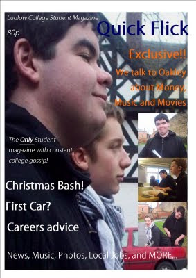
I was having trouble deciding what kind of layout i wanted my music magazine to follow. So i did some interenet research, and looked at the R&B magazine 'Vibe' The front page always had an R&B artist/s on the front, always looking at the camera, and usually a long or mid shot. The text is shaped around the image, and therefore it looks busy and interesting. The colour schemes are generally quite simple, and follow a pattern, which makes it look more sophisticated, and expensive. I think that i am going to design a layout a bit like 'Vibes' because i think that it is simple, yet effective.


Tuesday, 26 January 2010

Internt research, Fonts


I went onto the website 'Dafont.com' and found some really useful fonts that i thought would look goo on the front of a music magazine, i chose a different range, that will cover different genres of music, and look interesting and eyecatching.

Monday, 25 January 2010

Title ideas for my music magazine please comment (:


My music magazine is going to cover the genre of R&B


My ideas for the name of the magazine are:


  1. 24/7

  2. Hip to the Hop

  3. Grime

  4. Rolex

  5. Crank

  6. Stomp

  7. Bass line

I would really appreciate it if you could tell me which name you prefer (:

Contents page analysis, Kerrang


The contents page of 'Kerrang' magazine is layed out clearly, and in quite an ordered manner.

The background colour is dark, which makes the text stand out more, ans makes the page overall look more bold and eyecatching.

The 'Contents' font is scractchy, and ties in with the rock theme of the magazine and makes it look more interesting, and bold.

There are three images at the top of the page, which consist of mid shots and a long shot. They link to page numbers, which makes it easier for the reader to locate certain pages. The pictures also stand out, in two of them the people are looking directly at the camera, which make sthe reader feel more invloved, becaus ethey almost jump out the page.

There is another picture that is a mid shot in the left hand corner, and it is of a band member from 'Funeral of a friend'. He is looking directly at the camera, so it looks as though he is looking at you and gesturing at you, which makes you feel more involved. It also adds a sense of fun to the magaizne, and makes it more interesting. Readers can recognise what the picture is about, and because the page number is directly above it, they can locate it quickly.

There is a special offer at the bottom of the page which advertises Kerrang magazine and informs the reader that they can get the magazine chaply delivered to them, and makes the reader think about the offer and consider it.

Overall i think that this contents page is quite bold and clear, and it isnt too cluttered, so it makes it easier to locate pages that are relevant tp the reader. It is aimed at people who enjoy rock music, and the colour scheme, fonts and photos portray this.


Contents page analysis, Mixmag


The contents page of 'Mixmag' is fairly simple, and clear to understand.
On the front page there is a medium shot of a girl in the left corner, which takes up most of the space on the page, and draws your eyes to that first. There is also another picture in the right hand corner of David Guetta, this is a medium shot, but is alot smaller than the other picture, therefore it doesnt immediately catch your eye.

The page numbers on the two pictures are fairly large, and stand out, which makes it easier to find what you are looking for, and therfore more likely to buy the magazine again.
The background colour is black, and the text is in white, which makes it all stand out, and the colours compliment each other. There is also yelllow text, which stands out against the black background.

There is a banner at the bottom of the contents page which offers a 'free cd' and this makes people more interested because they could win something, and it makes it look as though the magazine is worth its money.

Text such as 'VIP' Aand 'Features' are in bold, which again makes them stand out, and makes the reader focus on the information that follows them because it seems important. They also have sub-headings in bold, which lets the reader know what the mini paragrahs are about, and enables them to find the page that they are looking for faster.

On the second page of the contents page there are more pictures which are bright and colourful and stand out. It makes the page look more interesting and busy. All the images are together on the right hand side, and this makes it easier to focus, and the fact that the page numbers link with the photos enavles the reader to find what they are looking for faster, because they can relate it with the photos.

All the subheadings continue in white against a black background, which makes it look more sophisticated. They are underlined and bold, and so are clear to understand means that pages are easier to locate, which i feel is important.

I really like the layout of this contents page because i feel that it is easy, and clear to understand, and enables people to find what they are looking for. The pictures really stand out, and i really like the colour scheme because it is bold, and looks flashy. I think that the font and the text colour really compliment the page, and makes it look more expensive, and worth the money.

Internet research, different genres of music magazines


I found magazines that covered music genres such as:


  • Pop

  • Rock

  • R&B

  • Club

  • DJ

  • Indie

  • Grime

  • Acoustic

Friday, 22 January 2010

Textual analysis 2- Q magazine


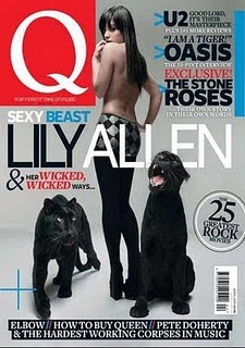
This magazine is very eyecatching, and i think that if i saw it in a shop i would stop and buy it, simply because the front page looks so bold and interesting. The colours are quite classy, and stand out, they all compliment each other, and then the red Q in the top left hand corner almost jumps out the page because it is bright and stands out, this is also ths masthead, and usually the first thing you see when you look at the magazine.

Bands such as 'U2', 'Oasis' and 'The Stone Roses' have a red 'Exclusive' by them to push the story, and sell the magazine. These are indicated wth blue arrows, which again makes them stand out and draws your attention to them. It also makes you think that the magazine is worth its money because its exclusive, and only in that magazine.

'Wicked, Wicked' is bigger than the rest of the byline to make it look more dangerous and also sexually relating to the image of Lily Allen on the front page with two panthers. The image is a long shot, and uses simple colours so that it isnt too overpowering, and looks more expensive. Lily Allen in topless and facing away, and this draws men in, and 'Sexy Beast' that is by it turns more attention to the picture, and it could show that Lily Allen has a wild side, making people want to buy it to read about her.

The price is very small and hidden in the right bottom hand corner, generally because it is £3.90, which is quite expensive for a magazine. This means that people are more likely to buy it because they havt looked at the price, because it isnt right there in your face.

'25' stands out, and is in a circle, this is done to draw attention to the fact that you are getting alot for your money, and makes it seem like there is alot of conten, therfore worth buying.

Tuesday, 19 January 2010

Audience Questionnaire

1. Gender:
[] Male
[] Female

2. Age:
[] 10-13
[] 14-17
[] 17-20
[] Other Pease state ........

3. Current Education:
[] School
[] College
[] University
[] Work
[] Other

4. Favourite Genre of music
[] Rock
[] Pop
[] RnB
[] Classical
[] Country
[] Heavy Metal
[] Other (Please state)..........................

5. Would you prefer the magazine to be on one genre of music, or feature a different rage of genres?
[] Just one genre (please state) ................
[] A different range of genres
[] Don't Mind

6. Whats you favourite music magazine?
[] Kerrang
[] Q
[] Top Of The Pops
[] Mojo
[] Rock sound
[] Metal hammer
[] NME
[]Other (Please state) ..........................

7. Whats your prefered colour scheme?
[] Black and Purple
[] Black and Pink
[] Different shades of blue
[] Pink and Purple
[] Red and black
[] Red and white
[] Other (Please State) ...................................

8. Would you prefer more pictures or more text?
[] Pictures
[] Text
[] Both, equally balanced

9. How much would you be willing to pay?
[] £1.50
[] £1.80
[] £2.00
[] More
[] Less

10. How often would you buy a music magazine?
[] Never
[] Very rarely
[] Once a month
[] Once a week
[] Other (Please State) .........................

11. Would you prefer: (tick two)
[] Information on gigs and tours
[] Latest gossip on music/bands
[] Competitions
[] Reviews on albums and gigs

Thankyou :)

Tuesday, 12 January 2010

Textual analysis 1- Kerrang magazine


I have analysed and examined this Kerrang magazine, and explored the different types of genres and styles that a magazine can contain. The magazine has a masthead which is 'Kerrang' (the name of the magazine) and this uses onomatopeia because the word kerrang sounds like an electric guitar sound, which associates the magazine with loud music, also the way that 'Kerrang' is cracking like glass suggests that the magazine is about loud music. The masthead is eye catching, and bold. The price shows that it is on special offer, which draws people in.
The price is positioned just below the masthead, so that it is clear and visible to see, and makes people think that the magazine is even more worth getting because its on offer and therefore makes it seem more appealing. The Strapline is individual to the magazine, and shows the people looking at it what the magazine includes. For example it says "WIN! A SIGNED LED ZEPPELIN GUITAR" this draws people in because they could win something, and makes them think that the magazine is more unique, and therefore worth buying. The Cover lines are bold, and stand out, and the main cover line is "GUNS N'ROSES CHINESE DEMOCRACY:IT'S HERE" and this looks as though it is the main story, and that alot of people would be excited and interested about it. This also draws people in because it is so bold, it looks important so makes them more liukely to stop and read it, and hopefully buy it if it interests them.

The image is of Axl Rose and is a medium close up. It almost looks as though he is performing to you, and stands out, almost jumps out the page. It makes the magazine look more appealing and stand out more because the artist is right there in your face. The target audience looks as though it is teenagers that are intereseted in rock music, and want to hear about their favourite bands, enter competitions and generally read about rock music. The Brand identity is 'Kerrang'.


Friday, 8 January 2010

Starting my music magazine


10 Weeks in total

Week 1-


  • Start Textual analysis
  • Update Blog

Week 2-

  • Textual analysis
  • Questionnaire, audience feedback

Week 3-

  • Internet and audience research
  • Treatment sheet
  • Colour and Font


Week 4-

  • Draft Layouts
  • Photoshoot

Week 5-

  • More detailed drafts
  • Concentrate on structure and layout


Week 6-

  • Constructing Page, front cover
  • Looking at different designs and styles


Week 7-

  • Constructing Page
  • Contents Page
  • Reviewing questionnaire


Week 8-

  • Constructing Page
  • Double Page spread
  • Reviewing questionnaire


Week 9-

  • Evaluation


Week 10-


  • Evaluation