Friday, 11 December 2009

Evaluation question- How did you attract/address your audience?

In my magazine i included features and topics that students are intersted in. I made sure that the front cover was bright, bold and eye catching, because you usually buy a magazine based on what itlooks like, because thats the first thing you see.

I think that someone would want to buy my magazine because it includes pictures of students on the front, and generally looks like a magazine that would be interesting to read, because the front cover looks fun and young.

My front cover colours are quite bright, which stands out to other magazines and also says alot to the target audience (students) because generally
they are into bright, fun colours.

I included an exclusive to make it seem exciting,
and make it seem like you can only read that
exclusive in that magazine.


I made sure that my magazine looked like it was
packed full of information and stories, because
this makes it look more appealing and more worth it
for the price.

Evaluation question- What kind of media institution might distribute your media product and why?


The kind of media institution that would distribute my magazine, are ones that are aimed at students. I think that the student council would distribute it because it contains information about the college and other topics that students would be interested in.

Wednesday, 9 December 2009

Evaluation question- In what ways does your media product use, develop or challenge forms and conventions of real media products?


  • My media magazine includes key conventions of a typical magazine.


  • My magazine has a masthead, 'Quick Flick' and the professional magazine also has one 'Student times'.


  • My magazine also has a banner at the bottom which gives an insight to what is in the magazine, and so does the professional one.


  • The professional magazine has a special offer, and my magazine has an exclusive. This indicates that you can only get them in those magazines, and reels people in to buy them.


  • My front cover also has an image on it which is quite interesting to look at, and draws people in, and so does the professional magazine.


  • My front cover also has headlines, like the professional one, so that the person buying it knows what to expect and knows whether its the right magazine for them.

Tuesday, 8 December 2009

Evaluation question- How does your media product represent particular social groups?


I think that my magazine represents most social groups, and i think that there are things in my magazine that would appeal to chavs, emo's, geeks, populars, jocks, musicians, skaters and generally 'normal' students. For example, there is a sport section for the jocks, a gossip section for the populars, a car section for the chavs, a fashion section for the girly girls, a music section for musicians, a skate/local skate area section for the skaters and other pages that they all might enjoy.
The front cover of my magazine is fairly neutral and isnt aimed at a particular social group, just college students, this means that everyone can find something that they would enjoy to read or look at.

Evaluation question - Who would be the audience for your media product?


I did a questionnaire to find out who would be the target audience for my magazine.

I decided that the target audince would be college students, as it is a student magazine.

The magazine will be uni-sex so that both females and males can enjoy and read it.

The magazine will cover different topics such as:
  • College courses/enrichments
  • Career advice
  • Gossip
  • Local news
  • Parties
  • Fashion
  • Cars
  • Movies
  • Music
  • Phones
  • Money

The magazine will be aimed at students that are interested in these things, and most students like one or more of these topics.

The magazine will have a trendy and young cover, so that the target audience is recognised as soon as you look at it.

The picture to the right is a montage of some of the things that students are interested in, and has been conducted from my questionnaire, and i have based my magazine topics and pictures on this.

Adding my magazine name to the contents page...


I have taken Carolines' advice and
decided to add my magazine name
to the top of the contents page.

Small Colour change to front page...


I made a small colour change, to the front page,
and made the name of the magazine 'Quick Flick' purple instead of blue.
I've realised that it doesnt stand out as well, and so i have decided to keep it blue.

Friday, 4 December 2009

Contents Page...


I think that my contents page looks busy and appeals to students because it has lots of images that are interesting to look at.

I also think that the headlines and stories appeal to students.

Please comment and tell me what you think :)

Wednesday, 2 December 2009

Front Cover :) Comment?


This is my finished front cover of my student magazine, any comments would be helpful, as i can still tweak certan areas, and adjust things to make it more appealing.
I think that i have put things on the front cover that would appeal to college students, and that are relevant to our age group.
I think that the picture of Jonny and Ollie works well as a background because it draws your eyes to the magazine, and also the colours work well so that i can add text to it, and it can be clearly read. The picture is also a medium close up.


Thursday, 26 November 2009

Week 1 Review

My action points for week 1 were:
  • Research and plan the front page, create mock designs and collect ideas together.
  • Complete two textual ananlysis's of exising student magazines, compare.
  • Create an audience questionnaire

I have completed all my action points, and i have also started on week 2, by designing the front page of the student magazine, and asking for people's opinions.

I have researched existing student magazines, and got some ideas from them, i have also analysed the way they are set out, and how they catch your eye, because i feel that a magazine needs to catch your eye from the front page, otherwise you arnt going to buy it.

So far i have had two people comment on my questionnaire and give their feedback, and their opinions and advice have been fairly helpful, and have helped me make some decisions about certain things.

Magazine designs...


I have created three simple designs for the front cover of my student magazine, i would greatly appreciate it if you could give your own opinions on these designs, so that i can get an idea about what type of colour schemes/ deigns students would like to see.
Any other ideas would be greatly appreciated :)


Wednesday, 18 November 2009

Textual analysis 2


'The second student magazine i have decided to analyise is called 'Student Times'. This magazine immediately looks more sophisticated than the 'Student ID' magazine that i last evaluated. The masthead is 'Student Times' and this is big and bold, which draws your attention to it.

There is a big picture of Peter Kay dressed as a woman, and the cover line underneath it is 'Comedy, the K-Factor, Peter Kay- The bloke from Bolton is back!' The text is is white and red bold font, which makes it clearer to see and stands out on the page.

Other Cover lines include 'TONI&GUY' and this persuades people to buy the magazine because it has special offers, and this generally reels people in.
There is a banner at the bottom of the page, and this advertises travel deals and information, which is appealing for students, because generally students have to travel to get to college.
There is a strapline, however it is not in the usual expected place, it is near the bottom of the page, underneath the picture of Peter Kay. This basically outlines what is in the magazine, and this is an advantage because it tells students what is in the magazine, and they therefore can decide whether to buy it or not.

Tuesday, 17 November 2009

Questionnaire, please feel free to complete

Male or female?

[] Male
[] Female

Do you read any student magazines? (If yes please state)

[] yes
[] no

.............................

Would you prefer lots of pictures, lots of information or a bit of both?

[] Lots of Pictures
[] Lots of information
[] A bit of both

What would interest you in a student magazine?

.....................................................................................

What colour scheme would you find appealing?

.....................................................................................

How much would you be willing to pay for it?

[] 70p
[] £1
[] More
[] Less

Which of these names do you think is best for a student magazine?

[] Quick Flick
[] Refect Read
[] Shaken

Monday, 16 November 2009

Textual analysis 1


I have started to look at existing student magazines, analysing and evaluating them, so that i can get a feel for what i want to include on my front cover.


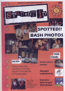
The first magazine i have decided to analyse is a Ludlow college student magazine from last year. To start with there is a brand identity, 'Ludlow college student magazine' and this distinguishes it from other magazines and enables the target audience to recognise it easily.


Cover lines such as 'Fashion with Lizzie' , 'Art Show Preview', ' Exam stress sorted' and 'Olympic controversy' are used to draw in the audience, and let them know a bit about what is included in the magazine. They are near the bottom of the page, and this makes it easier to read because its set out in little summaries.


The Masthead is 'Student ID' and this relates to students, and portrays the fact that the magazine is aimed towards students. The masthead is bold, and bigger than the other text on the page. This draws the audiences attention to the magazine, and intrigues them to buy the magazine because it looks exciting and interesting.


The headline is 'Spotted!! Bash Photos'. This is near the top of the page, just underneath the masthead, and it is also surrounded by photos of students at the bash. This makes the magazine look more interesting and it gives the impression that it is full of information and photos that students will be interested in. It draws your eyes to the magazine because it is in bold font, and looks important.


The magazine is a hybrid and includes different genres such as:


  • The bash


  • Exams


  • Young enterprise


  • World issues


  • Art


  • Fashion


  • Careers


The layout of the front page makes it look quite fun, and gives the impression that the magazine is packed with lots of different information, that would appeal to students. However i feel that the layout is a bit childish because all the photos are wonky, and it could have been made more sophisticated, whilst still appealing to students at the same time.


A lure is used and this is 'The Young Enterprise team win a prize!'. This makes the audience want to know more about that story, who won, what they won and how they won it.


The magazine is aimed a teenage students that would generally be interested in the main topics such as the bash, exam stress, careers and so on. The mode of address is a fun theme, and it speaks to the audience in an interesting and student like manner.


Action Plan


I have been asked to produce the front cover page of a new college magazine using DTP and an image manipulation program, featuring a photograph of a student in medium close-ups and some appropriately laid-out text and a masthead. I have also been asked to produce a mock-up of the layout of the contents page to demonstrate my grasp of DTP.


Week 1:


  • Firstly I will start researching and planning my front page, and come up with some mock designs so that i can start collecting ideas together.

  • Secondly I will complete a textual analysis of a few existing student magazines, so that i can get some ideas from other magazines, and compare them.

  • Thirdly I will create an audience questionnaire so that i can ask people about different magazines, and collect some ideas and opinions that will help me accomplish my task.

Week 2:


  • In this week i am going to start designing my front page, and look at different ways to set it out.

  • I am also going to start taking photos for the magazine, and experiment with different ideas to make it interesting.

Week 3:


  • I am going to look at more designs, and start thinking about the final design.

  • I am going to complete the first draft of pages, and get audience's feedback, and compare and analyse their opinions and ideas.

  • I will start to tweak, and change the pages, adapting them to make sure it suits the brief.

Week 4:


  • I am going to finish and evaluate the final pages.

  • I will make sure that everything is complete, and suits the brief.

  • I will answer the evaluation questions on the blog.